How To Protect Your Brand From Generic Logos?
Investing in a new logo design? Read this and understand the negative aspects of using generic logos that can damage your brand’s reputation right from the start.
What’s the first thing you need to get designed for your brand? If my research and common sense is on point, it’s your brand’s logo! How’d your body look without a face? Apart from creeping everyone out there’s no way of recognizing you, right? Your logo is to your brand as your face is to your body. So using the human analogy, other than identical twins who by the way have their own unique personality, no two faces are alike and that’s exactly how your logo should be. Distinguishable and unique!
Time and time again while searching for “inspiration” or just browsing across the web you may have stumbled upon certain logo designs which remind you of another brand’s logo. That’s the first step to failure for any brand that has an aim of penetrating the market let alone become the market leader. Unless your logo design stands out from the crowd of numerous logos, your brand will stay where it was: at the starting line.
Logos which resemble other logos or are created without a thought process are also known as generic logos and portray a negative image about the brand’s maturity and professionalism. After all why should I trust a brand that doesn’t invest time and money in its identity? A logo may not guarantee success for your brand but neglecting it might not even take you a step further towards your vision.
Generic Logos: in the spotlight!
The question arises as to how exactly do you avoid designing a generic logo or getting one designed? The simplest answer would be: just be original and creative, but that’s just too vague and there really isn’t any definition of creativity itself. Would Nike’s tick have been considered creative if it wasn’t really associated with the brand’s vision of “just do it?” The tick isn’t really something new but a brand story and being one of a kind is what sets it apart.
So here’s how you can really spot some generic logos and avoid owning one:
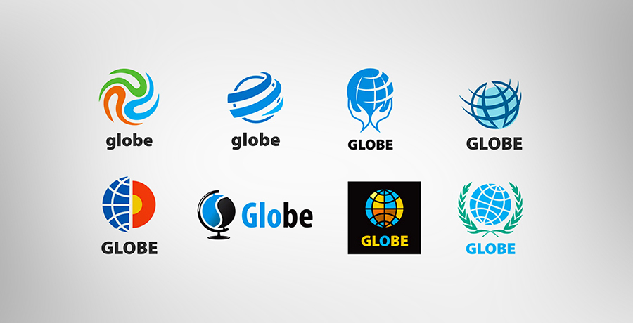
Globes are ancient!
They are an old way of exhibiting that “we cater to people globally” but read that phrase again, I said “old way”. None of us wants a cliché to be our logo. Globes are amidst the most generic logos that companies use and are so similar (naturally) that you end up getting confused as to whether the two companies with similar logos are related in some way or not.
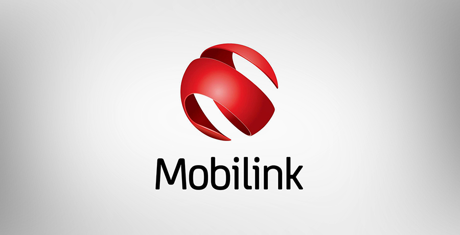
However there are ways of getting renewing old garbage. Take a look at this logo which represents the telecommunication brand, Mobilink:
The ribbon which was used to show that everyone is connected to each other through Mobilink here is arranged like a globe, representing the global approach of Mobilink and depicting it as a brand which offers international services.
Advice # 1: the globe is an old trick that makes it easier to create a generic logo with little effort other than designing and your brand ends up lost in the crowd.
V won’t give you victory
I think I might just get nauseous if I see this logo associated with one more brand! As done and dusted as this concept is, the V man is still alive. The V shaped person abstract is now mostly used by service providers or NGOs to portray that they are a people-oriented organization. We all need to move on from the V people! Even though the concept might be justifiable since customers are eventually humans, isn’t that a given? Do you need your logo to include human abstracts?
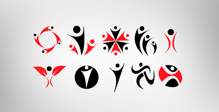
Think about 10 logos using the same V man in different forms? There’s nothing unique about them and each brand has the same story: we cater to humans. Slow claps please.
Advice # 2: Look out for the V men and don’t let your logo fall in the wrong hands.
Graphs can take you down!
I’m not sure if you’d ever consider using graphs for your business logos but all I can say is: please don’t. Firstly like all other generic logos, graphs aren’t exactly a creation. They have always been there if you know what I mean. Thus, using graphs for your logo design (even if you are an accountancy firm) is a declaration that you didn’t have the time, money or vision to actually invest in a logo which stands out.
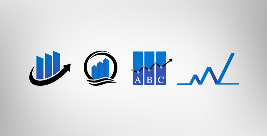
Advice # 3: A graph does not only honor the G in generic completely, it’s not even attractive as a logo and is hence a big thumbs down for logos.
Abstracts need concepts
I’m not against abstract logos but 2 lines that don’t mean anything are just 2 lines, nothing more. Beware of the so called creative abstract logos which have no concept associated with them.
Generic logos split into industries
Apart from the logos which have spread like wildfire in the branding world there are some generic logos which are specific to particular industries. One look at these logos and you’ll know which industry they belong to: guessing the brand however won’t be an easy task since they’ll all look the same. Duh!
Real Estate logos
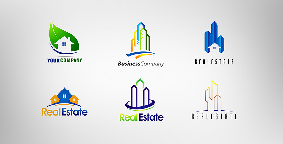
The most generic real estate logo designs sprout from the name of the industry, “real estate”. Seen enough of those buildings with skylines? Those are the most common sort of Real estate logos. Though there’s no denying the fact that your Real estate logo should portray the functionality of your brand that is “who are you?” but the cliché of designing buildings or houses is a concept as old as time. Need some creative thought on this? Check out some cool real estate logos. You can get one for yourself from the house of logos: FullStop!
Sports Logos
Using mascots in sports logos has become somewhat of a been there done that concept. Brands like the Premier League logo need to maintain their mascot logo since it has established a connection with their fans over almost a hundred years but the same rule does not really apply to new brands.
Brands need to get over the abstract of a bat and a ball for a cricket club or a tennis racket for a tennis club for instance. The start logo is a particular favorite amidst generic sports logos. Take a simpler yet much thoughtful approach towards getting a logo designed for a sports oriented brand. See some examples below:
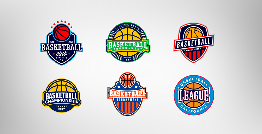
Did you spot any mascots or sports equipment? Again your logo needs to tell a story and using mascots isn’t entirely a NO but does that mascot represent something? Visit our home ground to get a creative logo for your Sports brand.
Accounting logos

So your organization deals with number, does that mean you can’t stand out as a company? The easiest and most generic logo designs for finance and accounting firms are either geometric shapes with the initials of the company or to make it simpler, just the initials. The verdict mostly from an amateur designer would be: “you don’t need a creative logo”. Let us show you how Accounting logos can be creative.
Clothing logos
As a lay person what’s the first logo design that pops in your mind when you’ve decided to launch a clothing brand? A clothing item! Shun that thought immediately and take a look at some renowned clothing brands. Do you see a piece of clothing in their logo or even an abstract of a product for that matter?
The most clichéd logos for a clothing brand are the ones that say “Hi, I’m a clothing brand”. You need to show the millions of customers who are interested in millions of clothing brands, what sets your brand apart and a generic logo such as shirt, a dress or a hanger just doesn’t serve that purpose. Check out some ideas for clothing brand logos here.
Pet shop and related products
Could I have some guesses for the most common pet shop or pet brand logos? That’s right: a cute little animal. How convenient! There’s nothing easier to think of for a cat food brand than the image of a cat but if you really want your brand to be noticeable you’ll settle for something that does require a piece of your mind and money, right?
However, if your brand is one which doesn’t require a lot of digital hype or advertising, there’s no harm in opting for a generic logo with an adorable puppy.
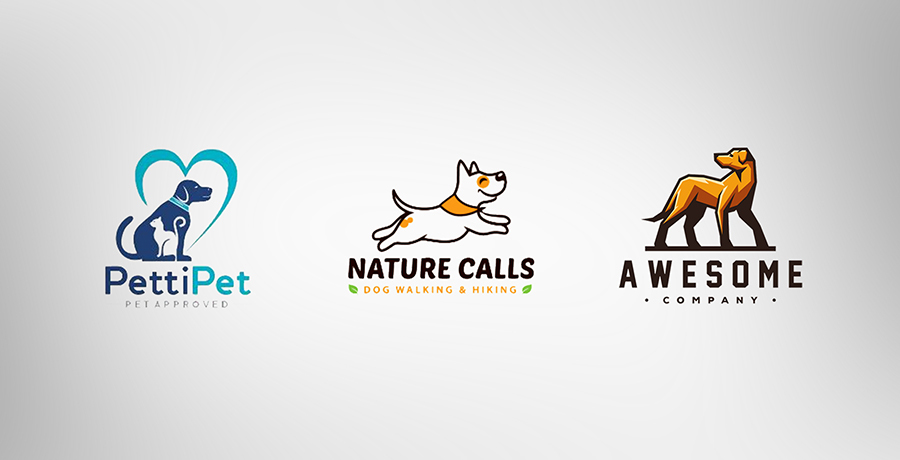
Need a creative logo for your pet store or pet food business? Check us out!
Fitness logos
Got a gym or fitness center that you want to take to the next level? Don’t fall into the trap of $5 designers who will give you a clichéd logo which depicts a body builder guy or at times a girl and a guy working out if yours is a co-gym.
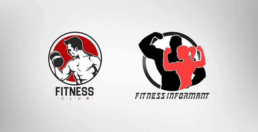
There’s a hundred other creative ways of creating a fitness logo without going down the “that’s so obvious” road again. Give your audience something interesting and make your brand stand in the spotlight. Get your very own creative fitness logo.
Restaurant logos
My personal favorite! There’s just so much one can do with a restaurant logo depending on the image you want to portray for your restaurant. What is it that sets your burger apart from other? You can definitely not do that with a generic logo!
Common logos for restaurants will take your brand nowhere unless you’ve had a presence since 50 years and are trusted for your taste and quality. Of course as mentioned earlier a logo can only create the first impression: does it last? That’s for your product and services to ensure.
Some generic logos for restaurants include either a cartoonish chef or a vector of a burger for a fast food joint, with the company name written in the middle or pizza slice for a pizza place and you get the gist of it, right?

Now let’s see some logos for restaurants that you can distinguish even without their names!
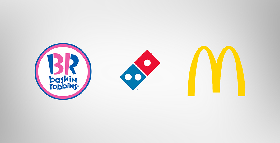
All these logos above are amongst the pioneers of excellent taste and quality in their respective food categories but there’s no logo you’ll find similar to theirs that might have emerged before their existence in the market. Stay creative, tell your story through your logo and get spotted amidst the crowd of brands which are born daily. Get you restaurant logo here.

Co-Founder & Strategic Visionary at FullStop
Co-Founder at FullStop, a branding, digital and software agency he started in 2012. Haris works across brand design, digital marketing, and custom development—helping businesses turn ideas into market-ready products.
Ready to transform your brand?
Our team specializes in strategic branding and digital solutions that drive real business results.