27 Best Cool Minimalist Fonts for Professional Design
Ever wondered why every designer love using minimalist fonts? Let’s discover how using cool fonts for logos can give your projects a fantastic feel.

Disclosure: This article may contain affiliate links. We earn a small commission at no extra cost to you.
When a client is looking for a designer to make a professional yet approaching logo, they expect to make a forefront before visualizing the style. It would be best if you searched for an artistic and trustworthy style that will go with the client's criteria and have minimalist fonts**.**
There hasn’t been any minimalist design without affecting the eye. Most of the people will assure less is more. Big companies like Google, Apple, Samsung, all go with extremely minimal yet the same font throughout the text.
Plain edges, and curves, regular size of each character, soft-touch, appropriate boldness, consistency, and not too jumbly, all are few aspects of the minimalist fonts. Some of the best logo fonts incite the brand’s primary purpose, without over complicating things.
Many consumers have witnessed the affection for minimal font rather than juggle or too bold ones. It may be due to the alluring first sight of the design, or easy to read feature. When the designer is asked to catch up on a lesser style, there can’t be any more arguments.
A wide range of minimalist fonts are available in the designer’s market; some of them are even free to download. Here I have assorted some of the best fonts for simple, plain yet elegant, and graceful logos.
Museo Slab by Xlibris Font Foundry
The characters are small, but the effect is high. This typography makes a real understanding of the brand’s liability. There are no italics or too bold, making it a useful font for blog titles and social media sites.
 Museo Slab by Xlibris Font Foundry
Gidole by Andreas Larsen
This typeface is currently used in google maps. The characters are spaced with accuracy. It is the reason why Google found it useful in applying for its apps.
 Gidole by Andreas Larsen
Blogger Sans by Sergiy Tkachenko
Blogger sans typeface has almost all types of fonts starting from simple italic to medium bold. Mainly used in the title, the letters are all linked together. Most of the blog and article sites use this font.
 Blogger Sans by Sergiy Tkachenko
Perfograma by Asen Petrov
The letters are sturdy and elegant, but the idea is through old-time typing machines. Asen Petrov wanted to reinvent the 18th-century strategy to make it unique and proffering grace.
 Perfograma by Asen Petrov
Capsuula by Henrich Fichna
Each character is lightly spaced and rounded from edges to give a curvy look. The artist of this typography gave an open-look to the minimal font.
 Capsuula by Henrich Fichna
Quicksand by Andrew Paglinawan
Andrew Paglinawan originated Quicksand, styling it with an equally spaced font letter. He also made another design of dashed style for titles of social media in the same typeface.
 Quicksand by Andrew Paglinawan
Infinity by Tarin Yuangtrakul
The letters are carved from the top, and capital and small characters are of the same length. The design is specifically for clothing brand emblem style.
 Infinity by Tarin Yuangtrakul
NOOA by Antoine Pilette
All the fonts are made from capital letters, highly spaced, elegant, and modern look for vector drafting.
 NOOA by Antoine Pilette
Panama Light by Adrien Coquet
The design is retro and vector style for a modern look and digital visualization. The stands of some letters are edged downwards, and spacing is moderate too.
 Panama Light by Adrien Coquet
Loew Heavy by The Northern Block
This typeface is available in forty different languages. The font is bold, straight, and avoids urgency look.
 Loew Heavy by The Northern Block
Znikomit by Grzegorz Luk
In the case of the font by Grzegorz Luk, Znikomit made one of the best logo fonts. The typing is thin, tall, and no italic or boldness make it easy for understanding and unique.
 Znikomit by Grzegorz Luk
Gasalt by Remi Lagast
The characters are geometrically characterized. The spacing is more than usual, and the fonts are mainly used for the main title.
 Gasalt by Remi Lagast
AW Conqueror Sans Light by Jean François Porchez
The typeface has a touch of roman times and comes with a combination of bold and lightly curved characters. Many magazines use this typeface for the main title on the front page.
 AW Conqueror Sans Light by Jean François Porchez
Kel by Keine Martins
The characters are edged and force straightness into the whole typeface. Mainly used in the text-body of newspapers, this typography is attractive with leniency.
 Kel by Keine Martins
Tondu Beta by The Northern Block
Thick, bold, small, and large jumbled typography is made for an easy read and give a chunky look to the emblem.
 Tondu Beta by The Northern Block
Planer Regular by The Northern Block
This typeface is used for the in-text body. The artist wanted to make sure to give it a charming yet increased readability for the consumers. The brands using this font in the logo usually gain the trust of the clients.
 Planer Regular by The Northern Block
Qontra by Tomaz Hrastar
The symbols are precipitated with small and capital forms. Tomaz Hrastar made it significant to use in blogging sites, social media, etc.
 Qontra by Tomaz Hrastar
Vegur by TipoType
The san serif typography is used to waver a creative look for styling and designing an emblem. The figures are close to each other and revolve around neutrality.
 Vegur by TipoType
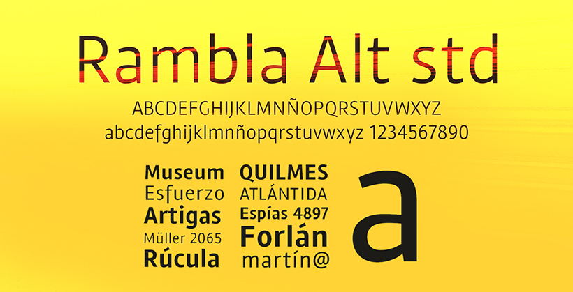
Rambla Alt by TipoType
The letters escalate an essence of simplicity for the buyer. The font is applicable for the in-text body and makes it facile.
 Rambla Alt by TipoType
Ahamono by Alfredo Marco Pradil
The font is merely complicated and recommended for headlines. The characters are entirely and prosper peacefulness.
 Ahamono by Alfredo Marco Pradil
Archivo Black by Omnibus-Type
Bold, exquisite, and strategical font from omnibus type are all equivalent and waver honest look.
 Archivo Black by Omnibus-Type
Asap by Omnibus-Type
The characters are round, curved, and pretty astounding. It is mainly used as the title text of many food companies.
 Asap by Omnibus-Type
Kanji by Pedro Azedo
The font is double layered typography, inspired by Chinese and Japanese language font. In addition to this, the characters are lightly curved and segmented.
 Kanji by Pedro Azedo
Bavro by Marcelo Reis Melo
The font is linear, understandable, and uncomplicated. The typeface preferred for use in body text.
 Bavro by Marcelo Reis Melo
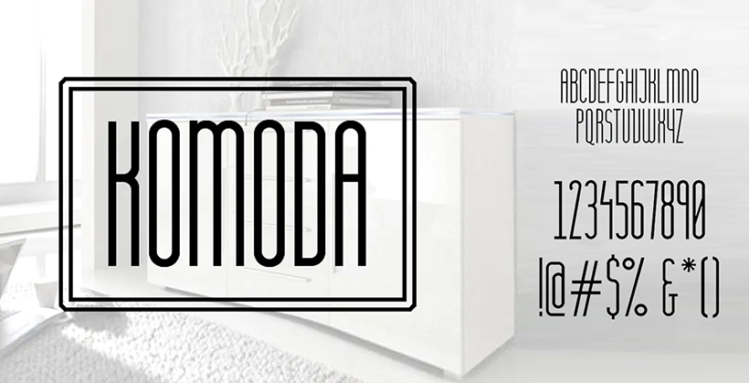
Komoda by Asia Ang
The characters are enlarged and linear, and there is no specification for small and capital letters—this font preferably used in vector designing of the logo.
 Komoda by Asia Ang
Arkhip by Klimov Design
One of the cool fonts for logos includes Arkhip. This typography is minimalist font designing and proffers an unpretentious look.
 Arkhip by Klimov Design
Kolikö by Alex Frukta & Vladimir Tomin
The characters are clean, resolute, and merely complicated. The approach is to visualize aspects of the brand’s liability.
 Kolikö by Alex Frukta & Vladimir Tomin
Final Thoughts
Those as mentioned above are some of the best logo fonts for the minimalist look. The characters are the main target for envisioning the client’s idea towards consumers. There is no guarantee that an expert will work better than the new designer. Sometimes, the aesthetic yet nominal is put forward by a better envisager. It all depends on the designer, how they picture the client’s demands.

Co-Founder & Strategic Visionary at FullStop
Co-Founder at FullStop, a branding, digital and software agency he started in 2012. Haris works across brand design, digital marketing, and custom development—helping businesses turn ideas into market-ready products.


