History of the Coca Cola Logo
Let’s look at the Coca Cola logo evolution and take key design lessons from this century old brand and see what young brands can learn in terms of design and branding.
We know it when we see it! The Coca Cola logo isn’t a sight we can miss and we know it like our very own creations. Heck, many of us might have had to actually trace this famous logo in our very first logo designing class! The red swirly logo isn’t a stranger to any of us (even non-cola drinkers).
However, how many of you out there know that the logo has been through a lot since the past 130 years, when the very first Coca Cola logo appeared on billboards and more importantly how many of you have actually witnessed some of those phases? Anyone here who’s above a century old? The logo has been through thick and thin since the first logo emerged in 1887 following the inception of the name Coca Cola in 1886!
P.S: I’d love to hear the Coca cola logo history from the logo’s own perspective, that’d it be really something. Alas! Allow me to take you on a journey of the Coca Cola logo history, date by date and logo by logo.
The Coca Cola Logo History
The C-tory: 1887 - 1890
It was one fine day on the 8th of May, 1886 that the formula of the black bubbly drink that our fast food can just not do without, was finalized by Dr John S Pemberton but the name was coined by Frank M Robinson who very rightly so predicted that the two Cs of Coca Cola would do wonders in the advertising world. Shortly after ticking the name, Robinson also designed the first of its kind Coca Cola script logo and had it trademarked in 1887!
So fond was Robinson of this logo apparently (and so are we) that he probably wanted the world to know that this logo is not for rental, purchase or borrowing, hence a probable explanation for including the word “Trademark” in the C of the first Coca Cola logo.
 Coco Cola Logo: 1887 - 1890
The C-drama: 1890 - 1891
And so the Coca cola logo evolution began. Following the demise of Dr. Pemberton, Asa G. Candler took over the brand and made some not so cool additions to the logo (no offense). The dramatic phase of the Coca Cola logo lasted only a year and it’s easy to see why since the logo was too fancy for a Cola brand. By adding extra swirls to the logo in 1890, the company wanted to indicate its association and support for music perhaps (not sure) as the logo portrayed a very musical feel. This version as mentioned above lasted till 1891 (a year) and did not gain much popularity.
 Coco Cola Logo: 1890 - 1891
A change in the tail: 1941 – 1960s
The Coca Cola logo evolution thus continued in 1941 (which was quite a jump from 1891) and this wasn’t a change that was very in-your-face. A slight tweak in the tail became part of the Coca Cola logo history. The word “trademark” was also pushed out of the “C” and was typed below the logo itself.
Don’t stop just yet because the Coca Cola logo history just got interesting.
Inserting the disc: 1947 – 1960s
Following a tweak in the Coca Cola logo tail, the script logo was merged with a red disc which some of us might surely remember: it’s nostalgic for the 50’s kids! A red disc with the image of a Coca Cola bottle and the Coca Cola script font was the new normal and almost every OOH advertising exhibited the new graphically vibrant logo. This advertising trend continued all the way to the late 60s.
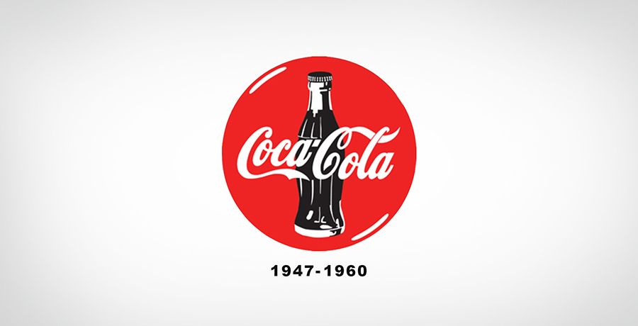 Coco Cola Logo: 1947 – 1960s
You may want to read: Pepsi’s long history of logos: A lesson in modern logo design from the past
The Fish tale: 1958 – 1960s
Apparently the period between 1940 and 1960 were the decades of continuous changes and innovations in the Coca Cola logo and more and more additions to the Coca cola logo’s history simultaneously.
The fishtail sign or the arc shaped background for the logo was introduced in 1958 and was rapidly being used for advertisements, in copies, on vending machines and a lot more promotional content. Why was the fishtail introduced? One can only guess. The reason might be that the script logo itself could not be visible enough on colorful or busy backgrounds especially with new advertising mediums emerging.
 Coco Cola Logo: 1958 – 1960s
The white wave and square take charge: 1969
Y’all probably know this one well, especially since the white smooth wave and the red background are still used for the Coca Cola logo! The Fish-tail or archform was trashed away in 1969 and replaced with a more mature red square whilst the script font was retained and a white flowing curve (or the white wave) was added beneath it.
 Coco Cola Logo: 1969
Coca Cola Logo almost drowns in Controversy – 2001
It wasn’t just the competitors who were trying to takeaway Coca Cola’s glory, some Muslim clerics objected to the logo itself, demanding an immediate renewal of the brand's logo! According to some clerics, the Coca Cola logo was actually a mirrored image of "No Muhammad, No Mecca" Nauzubillah so if you turn the logo upside down La Muhammad La Mecca" is apparently the brand’s agenda. A two month ultimatum was given to the brand in order to change the Coca Cola Logo which had been the only constant throughout the logo's evolution! As a result of this flame that sparked off, the brand allotted the task of actually analyzing the logo, to various clerics who did not find fault with the logo. Coca Cola also appealed that Arabic was a language which had not gained popularity in western regions and thus any similarity with the words is not intentional.

The image above shows how the Coca Cola logo was rotated at 180 degrees to prove the anti-Muhammad plot. We don’t really see the La but what are your thoughts on this? Myth or truth?
More fizz to the logo: 2003
With the competition engaging in a fierce battle, another logo was bound to be added to Coca Cola’s logo history. A pop of yellow was added to the original ribbon or white wave, along with some bubbles around the script logo, indicating a “real” feel. A stroke was also added to the script logo which was probably meant to add more depth to the logo.
The logo really caught one’s eye! The red and yellow together made some major progress in terms of marketing but the company had other plans and I endorse them completely.
![]() Coco Cola Logo: 2003
Coco Cola Logo: 2003
Interesting read for you: Starbucks Logo Explained: Complete History & Evolution
The Classic Finale: 2007
They finally made up their mind in 2007! The Coca Cola logo was revised after 4 years and the brand saved every element from the entire Coca Cola logo history which portrayed a classy feel: hence a classic logo was locked and presented to the Cola fans!
The not so new, yet polished logo incorporated the swirly, script font (which has been constant throughout the logo journey), the red square and a more refined white wave. The market leader believes in innovating with time but retains its original identity: you can’t improve upon perfection!
The logo is also now just a red Coca Cola script font and the two sister logos are used according to the advertising requirement.
 Coco Cola Logo: 2007
It’s worth noticing that apart from the slight change in the C curve of the original Coca Cola logo in 1941, the logo did not throw away its originality and the script font was never fired (though temporarily detained in 1890). A good brand knows the value of keeping its identity intact especially after making its make in the market (locally and globally), and a brand giant like Coca Cola sure knows how to stay in the game!

Co-Founder & Strategic Visionary at FullStop
Co-Founder at FullStop, a branding, digital and software agency he started in 2012. Haris works across brand design, digital marketing, and custom development—helping businesses turn ideas into market-ready products.
Ready to transform your brand?
Our team specializes in strategic branding and digital solutions that drive real business results.