6 most popular logos that have a great tell to tale
What is a logo? (Oh no I’m not elaborating upon that here). This question though, has been answered multiple times, in distinct ways. Some call it the first impression of a brand, others the face or identity that a brand wants to convey while many consider it has one of the core reasons for the success or failure of a brand’s advertising. None of that is untrue.
Yes, logos have been in the spotlight for quite some time. We keep learning something new about them every day.
However, logo designing has seen quite some interesting eras where brands gradually learned just how significant the “right” logo design was for their identity, impression and advertising.
Once upon a time, long long ago in the world of advertising and design, brands we recognize and love today with famous logos designed and redesigned their logo, some more than others.
They experimented often and moreover, as the clock ticked and times changed. They discovered the significance of changing their original designs to meet contemporary technological and advertising requirements but each logo nevertheless has a great story to tell.
Eventually they were able to create logos that set the standards for every brand that wishes to go up in the popularity chart.
And so the tale of the 6 most famous logos begins:
-
Google
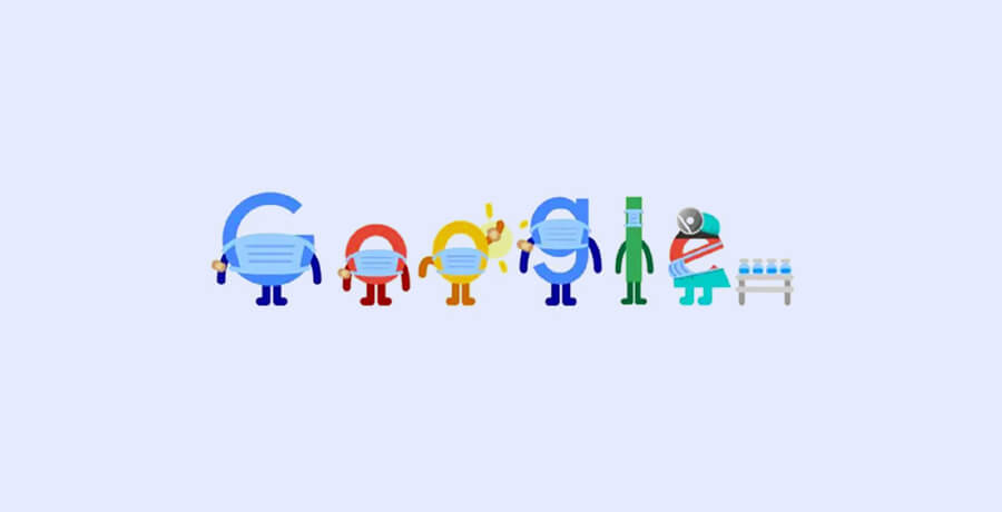
The moment you hear or read that name I bet you can see the logo in your head. You probably see it every day when you’re searching for almost anything over the internet. Google is one famous logo that never gets redundant to look at. Why? Google’s creative team just keeps giving us little surprises when we open our favorite search engine on a special day. Even during a crisis!
The tale of the O’s
The first Google logo was designed when the name “Back-rub” was changed by co-founders Larry Page and Sergey Brin (thank God for that!). Just imagine saying “Oh, you need some information on World Environment Day? Let’s Back-rub it”.
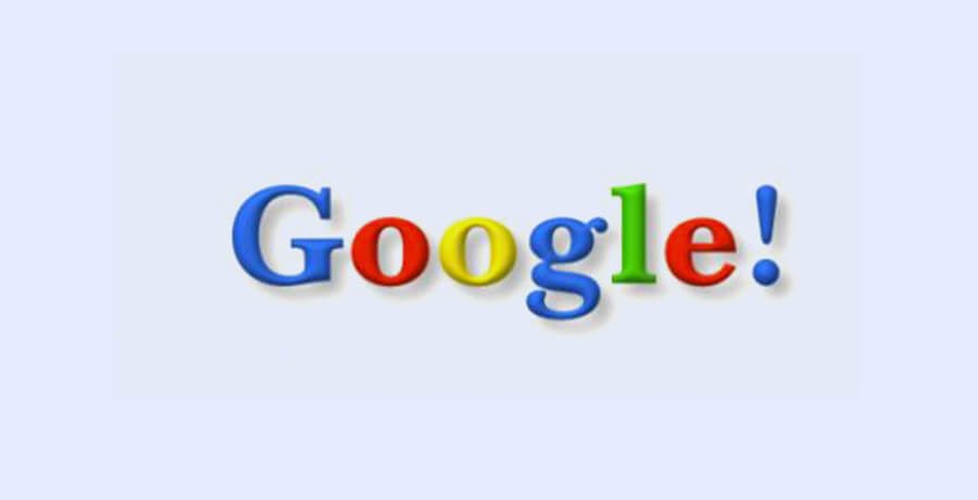
Thus, what can be called the very first Google logo, had an exclamation mark (supposedly following Yahoo!) but had somewhat the same look as the logo today. However, the 1998 logo did not survive long. In 1999, the two founders hired assistant professor Ruth Kedar who redesigned the logo. She wasn’t entirely successful initially since her first logo had a multicolored vector that strongly resembled a Chinese finger trap. Yikes!
Her next attempt too did not hit the target (pun intended). Using a Catull typeface she made the ‘O’ look like a target but it just looked tacky. Eventually after playing with the O’s she came up with a logo that stood out (no, no this was not the famous logo, but I’m getting there).
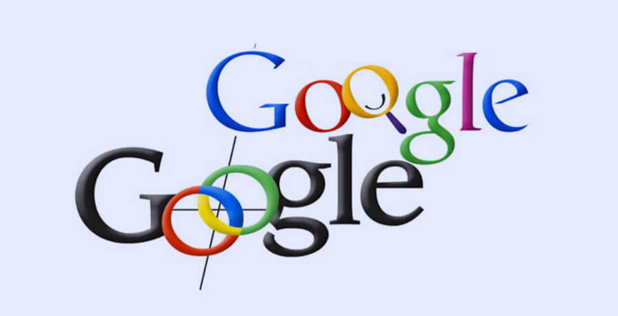
The multicolored Google logo with the magnifying glass looked modern, younger and fresh! Kedar wasn’t satisfied and eventually pulled out the magnifying glass, added some shadows to the logo and refreshed her design with a simpler version that looked a lot like the logo we love and admire now.
2015: happily ever after (the final design)
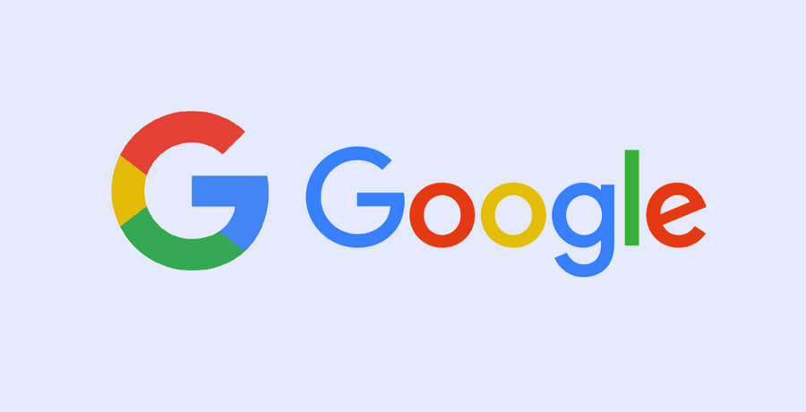
As the date on our calendars changed so did advertising mediums and technology. Designers at Google knew that it was time for a grand finale: a logo that could stand the test of time and so the creative minds from every Google station around the globe met at New York for a design sprint. The outcome was the famous logo that doesn’t need a second glance to be recognized.
From the original Catull typeface, designers chose a more modern Product Sans font while keeping the color pattern intact. However with the flattened version of Google in a different font emerged another variation for mobile Apps and smaller screens. The multicolored “G”.
Design lessons
Keep it interesting! That’s why the Google logo with its minimalist approach never fails to catch the eye. You can always see something new with the logo every time you access the search engine. It just goes to show that your logo may be simple but it all depends on your eye: can you see it in a creative light?
-
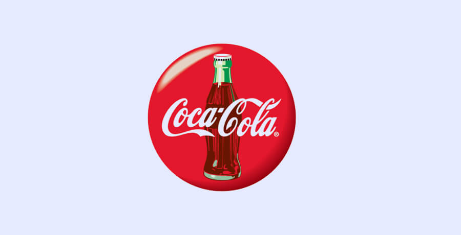
Coca Cola
Here comes the bottle that apparently drowns your sorrows – Coca Cola. Just playing along with the “open happiness” tagline. All puns apart, there is no doubt that Coca Cola isn’t just a famous fizzy drink, the Coca Cola logo is amidst the most popular logos of all time and one that has seen changes over a period of 130 years! Yes, that’s more than one lifetime. So, unless someone’s lived to see 131, none of you could really have witnessed the initial logo days of the famous bubbles.
The tale of the tail
Before I get into the whole evolution of how the famous logo finally came into being let me fill your cups with an interesting fact. The flowing script with its cool curves was first designed by Dr John Pemberton’s bookkeeper, Frank Mason Robinson who predicted that the two curvy C’s would look attractive in advertising. Was he wrong? We don’t think so!
He was also the person to whom Coca-Cola owes its name – so he ties in first place with the founder of our favorite bubbly cola (Dr John Pemberton). The Spencerian script used for the logo became a trademark in 1887 officially. You can see the words “trademark” in the initial logo probably because Robinson wanted the world to know “this is not available for sale or replication”.
The logo went a little musical for a year – looks like someone aka Asa G. Candler wanted to the logo to look “cooler”. That failed attempt was probably the worst makeover that this popular logo ever had to exhibit. It was just too much! Nevertheless, the world thankfully didn’t see much of the swirls since the design lasted for only a year.

Soon it went back to looking classy and the original font style stayed that way from 1941 to 1960 except for a few minor tweaks. The tail was slightly modified, the trademark was pushed outside the font and that was it.
Oh no, that’s not all folks!
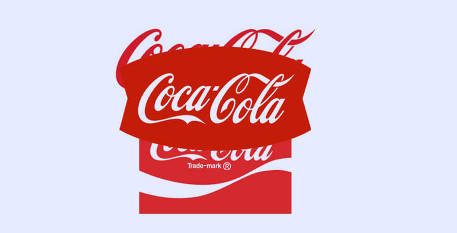
In 1947, a red disc was introduced to the script logo with the silhouette of a Coca Cola bottle. This eventually became a real hit and you could see your favorite emblem from afar.
In 1958 things got a little fishy and the disc was replaced with what looked like a fish-shaped background – no idea why the logo had to suffer this but there might be some rationale behind it.
After much struggles, the logo finally entered the white-wave phase that we still often see today. The company drowned the fish-tail and replaced it with a simple red background, white logo (the same script typeface) and a white wave underneath – now this was cool!
The logo you see today however is mostly without the white wave with just the script Coca Cola written in red.
You thought that was it? Here comes the real antagonist of this story – the controversy.
In 2001, the logo went on trial as some Muslim clerics claimed that the logo when seen upside down looked like “La Muhammad, LA Mecca” which in Arabic means “No Muhammad, No Mecca”. The uprising was so widespread that the company had to get the logo studied by top Muslim clerics from around the globe! The logo just had to pass this test to survive.
It was concluded that all such claims were false and this popular logo was cleared of all charges. Woo hoo!
Design lessons
Minimalism and consistency is always cooler than fancy designs. Another thought I’d like to share here is that despite all hurdles, the Coca Cola logo did stand the test of time and that’s the primary indicator of a successful logo.
An important read for you: 9 professional logo design benefits you hardly know about
-
Nike
The epitome of minimalism and a fine example of how simplicity can seldom go wrong.
Unless you suffer from memory loss (in which case I mean no offense), you just cannot forget the famous Nike swoosh – yes swoosh not a tick! This famous logo often has no word mark yet you don’t need to think twice before knowing the brand. As a matter of fact the popular logo is more of an adornment on the brand’s products and everyone from athletes to sports fans and even businessmen take pride in wearing anything that showcases the swoosh. They think it speeds up their popularity process – it does make a lasting first impression if not anything else.
Tale of the Swoosh
Here’s a little trivia before I jump onto the tale of the most popular logo in the sports world. The name Nike was derived from the Greek Goddess of Victory – oh yes the name itself signifies success! Why was this important?
Every great designer or team of designers create a logo that means something and if the logo can sync with the brand’s name not just the vision then you get a 10/10.

The irony behind the logo of a brand that earns billions of dollars is that its logo was designed in merely $35! No professor or design maestro is behind the crafting of this incredible logo. Even though the first impression that the logo gives off is that of a check mark since one would usually connect the tagline “just do it” to it and think “oh that makes perfect sense!” Little do some people know that the Nike “tick” is actually a “swoosh” or the wing of a Goddess. (Scroll right back up and give that trivia another read).
What makes the Nike logo stand on top is not how simple the design is but how such a simple design can be impactful throughout decades! The Nike logo was designed in 1971 and it needed no revamp nor any adjustments till date. The black swoosh stood the test of time better than any other logo we know so well. Another great fact about the logo is that even if you have zero knowledge about Greek mythology and the Goddess of victory, you won’t find the logo detached to the brand or the image it portrays.
Be honest, did you ever think there was anything that needed tweaking in the logo?
Fun fact: Davidson took nearly 17.5 hours to design the logo that we see as a simple swoosh, indicating that there was a lot of thought involved in the logo’s design. The logo was supposed to show on a shoe therefore as Davidson herself confessed in an interview, “the real challenge was creating a logo that could look good on a sneaker”. With competitors such as Adidas already dominating the market another task at hand was to create a logo that didn’t remind people of the rivals.
She tested her logo first on a tissue paper and later on a shoe. We can surely comprehend how it tool her 17.5 hours to finalize this logo!
Here’s another note in your bag: the Nike logo wasn’t always black! For a considerable period of time Nike’s swoosh was red, symbolizing passion, energy and power. They soon realized that black was what made the logo classier.
Design lessons
Whenever you are designing a logo or getting one designed for your brand, think about what the brand stands for? Does the name have a meaning or is there a history behind your vision? These are just a few minute details that can help you design a logo that can become a legacy and stay glued to your brand for centuries. Nike’s logo is one of the best examples of how a minimal, meaningful logo can be futuristic and can beat every technical advancement in years to come!
-
Amazon
Here comes the e-commerce giant! Even though Amazon is more famous for its name due to the popularity that this e-commerce web has gained, if you look a little deeper, the Amazon logo is a masterpiece. To a lay person it may seem like a simple word mark with an arrow beneath it and you’d think; “maybe they wanted to add some yellow to it”, but that’s far from true.
Let’s not spoil it yet. Allow me to take you through the Amazon logo design tunnel.
The Tale of A to Z
Amazon’s own tale is worth an entire blog, but here’s a little glimpse into the brand’s history: the e-commerce giant was originally founded in 1994 under the name “Cadabra” by Jeff Bezos which was later changed to Amazon as the name rhymed a lot with “cadaver”.
Following the change in its name, Amazon started to focus on its logo design and so starts a story as great as the brand’s own success in the tech market.
In the year 1995, Amazon’s first logo came into being. It was quite “in-your-face” as the logo exhibited an A with what was apparently a river inside and a blue backdrop. Let’s just say it wasn’t too easy on the eyes. Adding to the logo’s clutter was a tagline in brown which conveyed the brand’s initial message “Earth’s biggest bookstore”.
Perhaps it was the increased competition, awareness or the growth of Amazon itself that led to a more refined version of the same logo in 1997. There was still a river in the A but without the cliché effect. The busy ‘A’ was now simply a silhouette of the original design, reflecting the growth of the company. There was still room for improvement.

Just a year later the A was replaced with a word mark “Amazon” in upper-case and a yellow ‘O’. Personally I see nothing interesting about that logo but one can’t deny it was a lot closer to the popular logo we find so inspiring today.

Moving on, in the same year, the logo bid farewell to the upper-case version and shifted down to the lower-case word mark that we see today. Oh no, this wasn’t the end for the logo’s design switches.
Design analysts believe that the lower-case showcased Amazon as a more approachable brand since it was after-all meant to cater to the masses. Also the inclusion of the yellowish-orange color portrayed the brand in a more cordial light as it represented happiness and warmth.

The final version of the Amazon logo came into existence in 2001 when we saw a logo that wasn’t just fine-tuned but also delivered the brand’s message: “you can find everything here from A – Z”, represented by the yellow-orange arrow.
The logo redesign truly communicated how much Amazon had grown over the years and of course we’re all highly dependent on the brand for much of our online needs/wants. I don’t believe there is an e-commerce brand that conveys its message so perfectly!

Design lessons
Your logo needs to have an X-factor to it. Creativity doesn’t need to be fancy. It can be as simple as ABC or in this case A to Z. You just need to see how your logo can convey the brand’s message to your audience without cluttering up the canvas. Another point to note is that upper-case letter aren’t always your go-to when designing a logo. If you want to convey a friendlier persona, it’s wiser to tone it down a bit.
-
LG
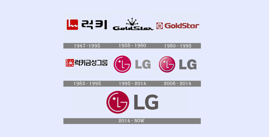
The electronics brand we all trust and rely upon too has a logo with an interesting tale to tell. The popular logo that you see today didn’t always have such finesse. Like many famous logos LG too has seen highs and lows. Before we dive into the story, you should know that the inception of LG was the result of a Korean merger. Two brands, namely Lucky and Goldstar joined hands to form one great company in 1983.
The Tale of L and G
Prior to their merger, both Lucky and Goldstar had their own logos. Lucky’s logo was more of an emblem with Korean inscription, a red and white color scheme and a prominent white “L”.
Goldstar’s logo was quite distinct from its future partner’s. Launched in the 1950’s, Goldstar’s logo was a subtle word mark with a crown shaped vector on top and a monochrome color scheme.

The two brands were not united yet. Goldstar’s logo decided to change color in 1980 and adopted a dark red and white color, abandoning the monochrome approach. No alterations

were made to the crown except that it was now surrounded by a white circle within a red square. The letters G and S in uppercase were also added beneath the crown. But that wasn’t all that changed. The word mark was recreated and you could now see a more contemporary sans-serif typeface with softer lines.
In 1983, following the merger, Lucky-Goldstar’s logo too needed an integration. Thus, the initial LG logo design literally blended the two individual logos. I’ll break it down for you.
So, what looks like a zigzag was actually an “L” inside a red square surrounding the crown of Goldstar. The typeface was written in Korean just like that of Luckystar’s logo. Let’s just cut to the chase here, they basically created a combination of the two logos now displaying a red, white and black logo for Lucky-Goldstar.

It wasn’t so bad but of course LG needed a different plan.
From 1995 – 2014, following the great merger, Lucky-Goldstar was shortened to LG but the name wasn’t the only thing that was new. From here on began a new journey for LG – the company and the logo. The new LG logo featured a circular emblem and a wordmark beside it. This was the same emblem that has now become one of the most popular logo designs in the electronics world.

Apparently the logo is a simple red circle with an L inside a G and a gray wordmark beside it with the letter L and G in Helvetica Black font. However the logo has more depth to it.
The red color signifies happiness and energy whereas the gray color signifies technology and innovation. The L and G within the emblem, composed like a smiling face portray friendliness and a happy disposition of the brand. The singular eye within the emblem is supposed to indicate how focused the brand is towards its goals.
So, did you think that red emblem that’s stuck to our memory was simply an abstract art?
Later the L and G were no longer popular has Lucky-Goldstar but rather represented LG’s slogan: “Life’s Good”.
Design lessons
Your logo design can convey your values and the relationship you want to create with your target audience. You can be simplistic yet meaningful in your approach. Colors too play an important part and you can be very smart about communicating two different personas for the same brand. In this case LG wanted to convey cordiality along with responsibility.
You should also read: 9 Reasons why I think your start-up will fail without a professional logo?
-
BMW
We hit the brakes when we see this logo. That’s how mesmerizing we find every BMW vehicle to be but it isn’t just the brand that’s famous, the BMW logo has its own impact on every automobile admirer. So, have you ever tried to learn about this spectacular logo that fits so well with every one of their products?
Shall we begin?
Tale of the propeller
Like every other famous logo, our favorite automobile company’s logo too has an interesting tale to tell. Though the logo did not face as many transformations as some of the logos mentioned above, it does have a history worth knowing.
The German automaker that produced aircrafts during both the World Wars, later utilized its skills in manufacturing cars and motorcycles that promised speed, luxury, durability and adventure.
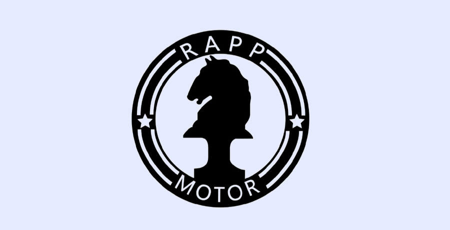
The company’s initial Rapp Motors logo (BMW’s initial name), featured the silhouette of a horse within a circle! They changed the logo along with the name (rightfully so). The first BMW logo looked a lot like the famous logo that has become a symbol of luxury and comfort for vehicle lovers across the globe.
To many the logo may appear as a wheel or simply 4 quadrants in blue and white color. Well, here’s a surprise. A company seldom leaves its roots and so the BMW logo actually signifies an aircraft’s propeller in motion with a hint of sky (exhibited by the blue color).

For nearly two decades the logo did not suffer a lot of changes except for minor tweaks such as replacing the golden outline with white and replacing the dark blue with lighter shades. However, from 70’s to the 80’s the logo encountered a shockingly dramatic modification.
The original emblem remained the same but was surrounded by more colors. I’m not sure why the company did that? Perhaps it wanted a fresher look or it needed to convey that the brand wasn’t stagnant. Well, you can see for yourself why this perplexes me:
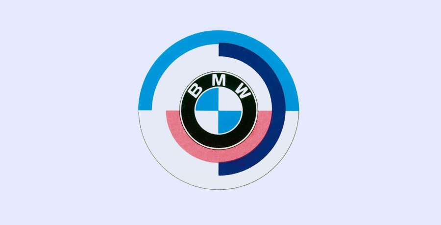
All’s well that ends well.
Eventually in the 1990s BMW erased the additional colors from the original logo, refined the emblem giving it a more polished, 3D look while the black frame was back in all its glory.
That’s not it!
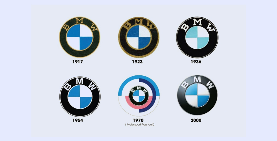
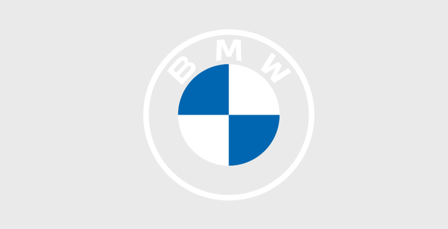
We’re in 2021 and in 2020 as the minimalist trend gained speed, the popular logo underwent one more transition. BMW decided to replace the 3D logo with a 2D version showcasing a white outline for the frame while the lines dividing the quadrants became non-existent. The result? A logo that’s more clean, minimalist and still represents luxury.
Design lessons
A symbol of a great logo and company isn’t always how many designs it has changed? Sometimes it’s more about how futuristic can their design be? Even though the BMW logo saw nominal changes, the logo had such a modern approach from the beginning, the concept and core design remained untouched.
-

Waqas D.
Waqas D. is the co-founder of the branding and website agency, FullStop™. He supercharges brands by crafting memorable logos, brand identities and engaging websites. Besides thousands of startups and medium-size businesses, FullStop has worked with likes of Microsoft & L’Oréal. View our portfolio or get in touch.
Get a Free Quote
+1 845 3770255
Call on anytime
To discuss your project
Featured articles:
Topic Categories
Interested In
Logo, Branding & Creative Work?


 We’ll get back to you in 24 hours
to address your needs as quickly as possible.
We’ll get back to you in 24 hours
to address your needs as quickly as possible.
 We’ll prepare an estimation of the project
describing the team compostition, timeline and costs.
We’ll prepare an estimation of the project
describing the team compostition, timeline and costs.
 We'll perform a free website review
If you already have an existing website.
We'll perform a free website review
If you already have an existing website.


