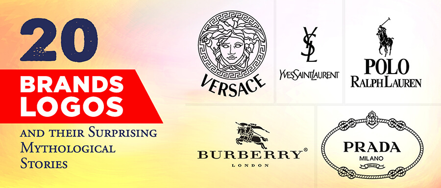
Complex Logo and Simple Logo Explained

Every year over 627000 new businesses are established. Each one wants to be more unique and innovative. Every business markets their brand according to the demographics. People are only interested in the brand that provides quality and fulfill their needs. However, there are some brands that successfully attract the masses with their unique logos and branding strategies.
Logos are like the gateway to the story that the business has to tell, they can either be an image, letters, or a combination of both. The logo makes the brand known worldwide by just a printed or digital copy. That is how powerful a logo is.
Images and symbols play an important role in human memory. It is in human nature to forget things easily. There are countless times when people have searched the internet while scrolling for images associated with their favorite songs. This is because images are easy to remember).
Purpose of The Logo
As discussed before the purpose of the logo is not to explain the whole story or to market a sole product from the organization (as the logo should be able to adapt to the changes in the organization). It serves to communicate and represent what the company is all about.
Such as Nike, the logo is inspired by or depicts the goddess wings: ‘swoosh’. The wings are the model of speed and power. The ease of speed and power is exactly what the company sells.
![]()
Different Categories of Logo
There are many types of logos and are usually used in combination to create elegant, impactful logos.
Emblems:
There are other names that are used interchangeably, such as seals or crest. This logo dates back to the middle ages.
An emblem is created by encapsulating text inside the symbols. They give the vibe of formality and make things official. They are mostly used by universities, schools, and government organizations.
Logotypes:
Also commonly known as a wordmark. These types of logos are solely composed of the company’s name. The graphic designer uses different fonts and styles best suited. This style relies on topography.
For example: Google.
Interesting for you: Difference Between Logotype, Logomark, And Logo
Monograms:
In this type, the designer creates the logo by using initials of the company, such as HBO or Minnesota Mining and manufacturing that sums up in the form of 3M as its logo. The important aspects to remember are: the logo should be readable and human friendly.
This is also very helpful if the name is very long and makes little sense.
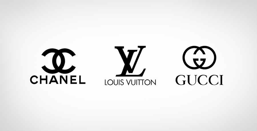
Example: Chanel, Gucci, Louis Viton.
Brandmark:
Also goes by pictorial mark or mascot. They have illustrations and sometimes initials, such as KFC. This kind of logo is super hard and needs heavy research. The logo should be unique and correlated to the brand’s vision.
Combination mark:
This kind of logo has both illustrations and text. Each text and image in the logo has its distinct presence and syncs perfectly with each other.
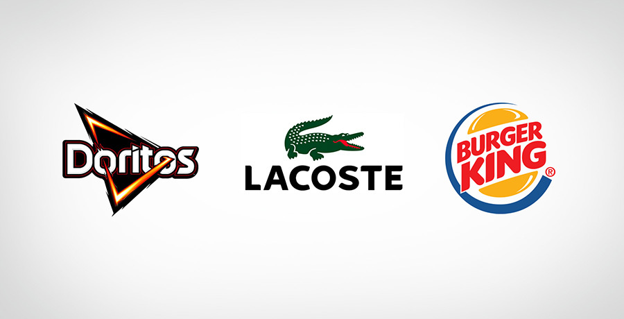
Example: Doritos, Burger King, Lacoste.
Abstract logo:
An abstract logo is more like a symbol that has a deeper meaning. The visual presents the audience with a chance to contemplate. The logo should be created with precautions as this idea could backfire. This gives the brand a unique stand, but few businesses adapt well with it.
Two Types 0f Logo Design
The types of logo design can be summed up in two categories:
-
Simple
-
Complex
Simplicity, in most cases, is the key to success. Having too many details on a logo can give mixed signals to the observers. A simple logo has a lasting imprint on people’s memory and in most cases is easy to change. They are also easy to print on a small scale as they use less ink and area. However, sometimes a simple logo can be dull. So it’s important to pour heart and soul into the research process.
Simple logos are hard to understand too. It’s hard to understand because there are few images or text to define what the logo is about. The color scheme is another issue. Science has explained that each color has its own effect on the viewer. Some colors are associated with hunger, while others are known for initiating excitement. The color scheme has to compliment the design. So finding a kind of intention, symbol and feeling can become easy that people can relate to.
Simple Logo Example
Simple logo design has always been in. They give a sophisticated and professional feel to the brand. Here are some examples of famous simple logos:
1. Google
Google went through a series of changes in its logo. The advantage they had was their logo was simple and effective from the start. The changes in the logo were never dramatic. This saved them from additional marketing.
 Example of simple logo design
2. Coca-Cola
Coca-cola just like google had a simple logo from the start that evolved with time and through a thoughtful process. The era and people’s preference also played a key role in changes.
 Another example of simple logos
3. Target
The target logo was inspired by bulls’ eyes, all that consumers wanted they had. On a survey, people expressed that the logo felt more welcoming and gave fewer corporation vibes.
 Target Logos - Simple logo design
Complex logos are more common than one would think. To qualify for a complex logo. A logo has to have many individual elements.It could have different images, text, or both incorporated synchronously. Many designers feel that the complex business logo or any logo is more appreciated, while some just love to show their creative skills. A complex logo can add a ton of information in a small space. It can make a brand survive for years.
A complex logo gives a field day to conspiracy theorists, business, and logo critics. They love to dissect every aspect of the design. Some would call it the new symbol of illuminati, and for others, it might make no sense. This criticism can spark interest in the audience and in most cases, like, Starbucks, make the logo the talk of the town. As the saying goes, any marketing is good marketing. But a good marketing team is needed, or it could very well destroy the brand.
The issues with this design are that they can be too complex and otherworldly. The audience at times cannot connect with them at first glance.
The printing price can also be higher as the design needs more space and ink. As the company evolves, it is bound to change. The production can increase or decrease with added or deducted items. Solely for this reason, a complex logo has a hard time adapting to changes.
Example of Complex Designs
1. Apple
Apple was once a complex looking in 1976, but later on, the team realized that the simpler the design is, the better it is accepted by the masses.
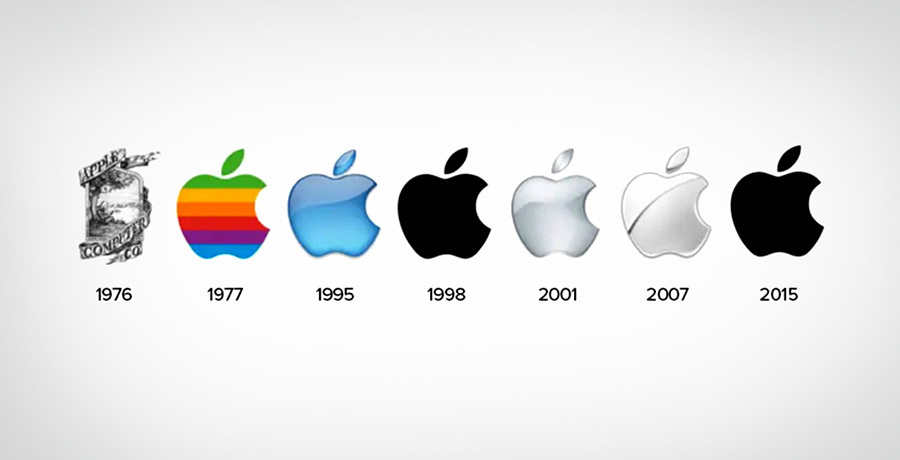 Apple Logos - Complex logo design to simple logos
2. Heineken
Heineken is a famous beer brand that was started in 1887. They had a complex logo back then. It was the era where colored printing was new. Every business and designers were keen to experiment. Later in 1991, they changed the logo to simple.
 Heineken Logos - Complex logo to simple
**3. Starbucks
**
Starbucks is a household name to people all around the world. Their first logo was very complex and had a seductress vibe around it. It later got changed under the new owner due to raising modesty issues. The brand wanted to expand its business circles. They felt that having coffee printed on the logo makes it very limited.
 Starbucks Logos - A journey from complex logos to simple logo
You may find it interesting: Starbucks Logo Explained: Complete History & Evolution
4. Fuddruckers
Fuddruckers is an American franchise that is especially known for its hamburgers. Founded in 1997. They too later changed their logo to a simpler version
The changes in these logos were the demand of the era. Great brands are those that can adapt to changes. All these brands changed over time and esthetic sense. One thing to consider is that all these brands are household brands. People already knew them.
 Fuddruckers logo - Comples business logo to simple
Complex Vs Simple
In a design process, it should not matter which type of design approach is being taken. The true purpose should be a logo with the brand message loud and clear.
The important aspect is, the design should be printable, cost-effective, adaptable, culturally appropriate and neutral. The design should be capable of being printed on a small surface or large. If not, it has to go back to the design table.
The motto, vision, and the stand of the company should be the base of the logo.
Both designs have their own advantages. With a great and creative designer and a visionary and innovative marketing team, a great logo with either design can be born.
Conclusions
The logo alone is not the ultimate answer for profits. This is one of the crucial mistakes that new business owners make. For a successful business, there has to be a whole branding strategy. The branding strategy by the marketing team helps the designer add meaning and intention to the logo. Font and different colors are used to trigger different human emotions.
Every minor aspect should be closely monitored in the design process. The logo has to be the trigger to happy, fascinating and pleasant memories that make the customers come back. Whatever the design approach followed, branding is the key that is going to make the logo next big thing in the market or just a logo dusted and forgotten.

Co-Founder & Strategic Visionary at FullStop
Co-Founder at FullStop, a branding, digital and software agency he started in 2012. Haris works across brand design, digital marketing, and custom development—helping businesses turn ideas into market-ready products.
Ready to transform your brand?
Our team specializes in strategic branding and digital solutions that drive real business results.